
New Home Paint Colors!!
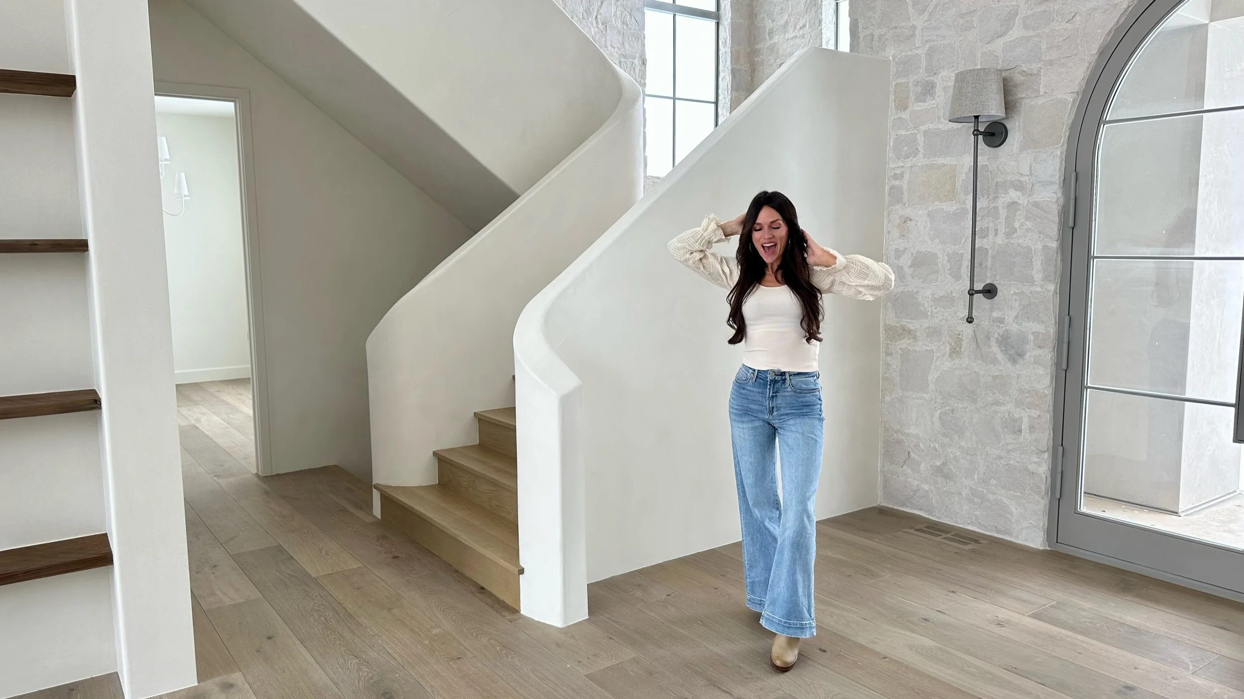

For our new home I wanted to keep the color palette minimal & fresh. Though I admire when others create bold, moody spaces I knew that wasn’t really my vibe so I steered away from the current trend and stuck to what I know I’d love long term. I adore organic, open, airy spaces that let the elements of nature feel part of the interior. Especially with the views in this location— I knew I wanted the focus to be on the exterior landscape. That majestic mountain backdrop is hard to top!

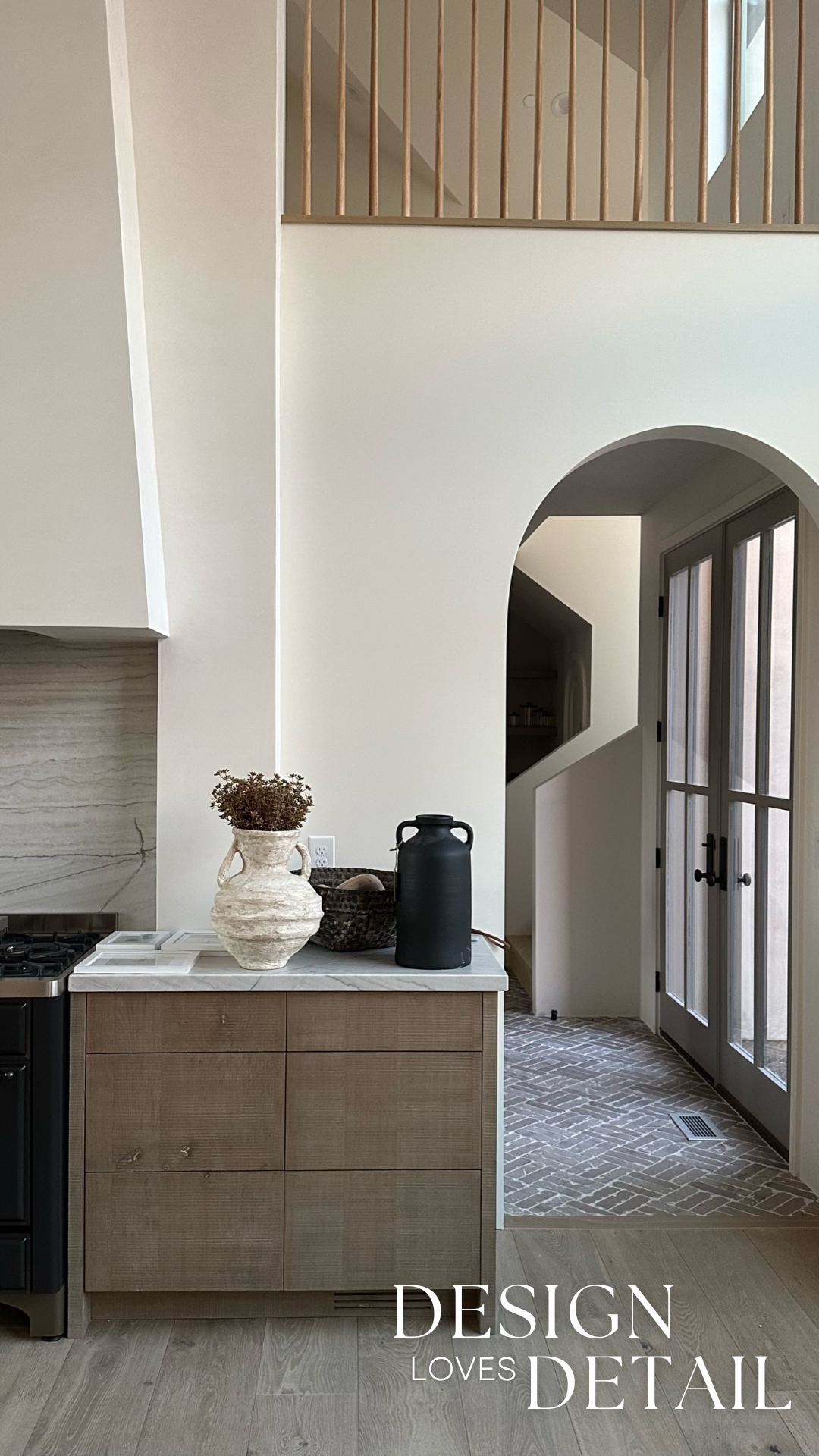
For virtually all of the interior walls, trim and ceilings I went with my favorite warm neutral— Benjamin Moore’s China White (in Eggshell finish on walls/trim, flat for ceilings). Its name comes from the fact that it looks like the rich tone of fine China. A saturated off-white that rather than a yellow base, actually has a greige undertone. For me, this is what sets it apart. It’s warm without having a yellow cast. This greige base also allows it to work with cooler tones. I’ve called it a chameleon color because of this. It is much more forgiving when mixing with other colors and pairing it with brighter whites doesn’t make it look dingy as some cream tones do.

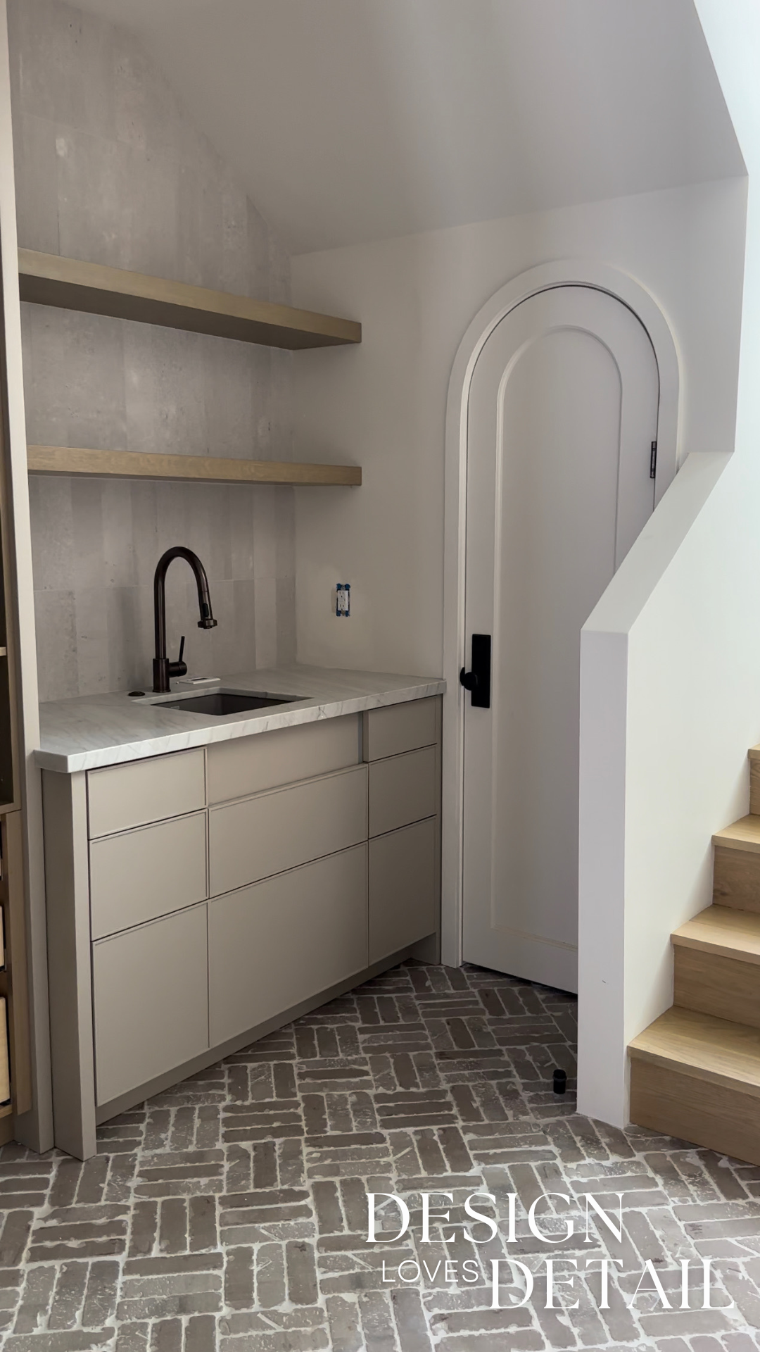
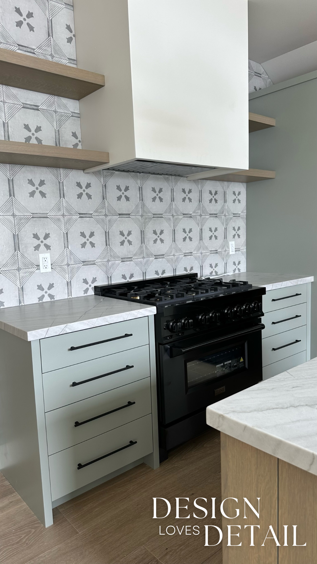
And though the walls are neutral, I didn’t want my home to feel boring. Part of my solution was to bring in cabinet colors with more depth and richness. I really love all these cabinetry paint colors! For the Butler’s Pantry and basement kitchen I went for another tried & true fave, Sherwin-Williams Morris Room Gray. This mushroom tone paint has the perfect amount of warmth & interest. It’s got a slight green undertone which I really love. It looks so good paired with the brick floor of our pantry and also with the wood flooring in our basement. This color is flexible too. A great one to use with the China White walls and even when selecting hardware it’s great with gold tones or black. Note: the kitchen island in basement is actually Benjamin Moore Collingwood, with a brown glaze over because I wanted the tambour fluted detail to stand out.


For the basement laundry room I selected Benjamin Moore Pashmina. I like that this color has a decent amount of saturation too. I dressed it up with bold countertops and floors. This one is a tan tone that has some warmth but still has some grey to make it a nice pairing with the greige undertone of the China White walls.

To bring some color and fun to the mother-in-law apartment I used Farrow & Ball Pigeon. I like how this tone reads as a dusty green that’s interesting and mid range in depth, but that it isn’t too “in your face”. It’s kind of a pseudo neutral. I love how it pairs with the wood island and shelves for an inviting feel.


The one exception to the moody spaces thing-- was our theater! That’s a space that I definitely got to have some fun with going bold. I used Sherwin-Williams Urbane Bronze for the walls and went high contrast with the lighter furniture and sconces. I also had fun bringing in texture with the fluted wall and corduroy style fabrics for sectional & chairs. I also love the way the plaster look scones pop against the bold walls. Urbane Bronze is awesome to me because it’s so much more interesting than black. It fits great with my overall color palette because it has an earthy base tone in the bronze color.

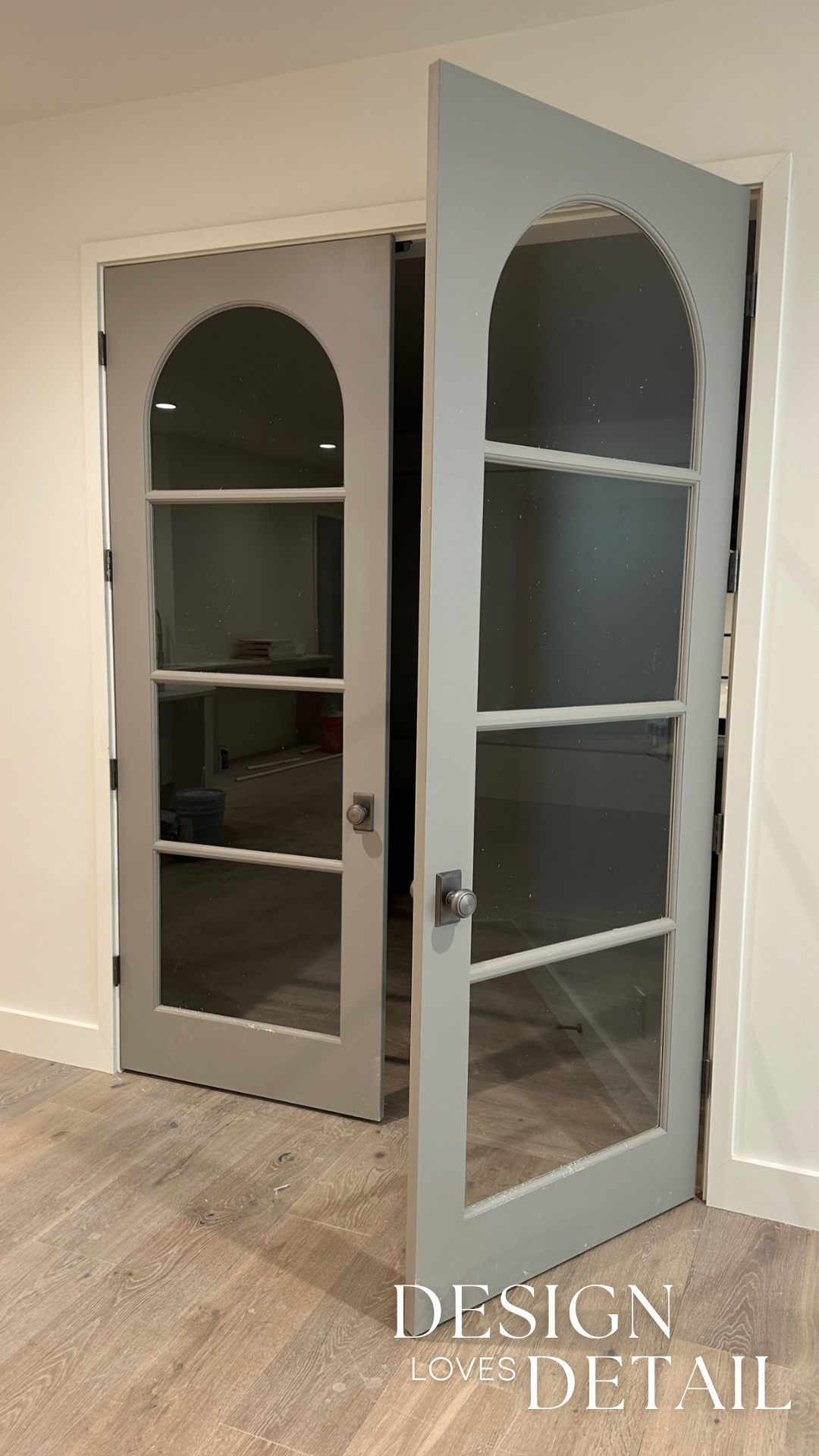
And I couldn’t forget the windows and doors! I wanted a unique color for these. Though I enjoyed the architectural detail of my black windows in our last home, I wanted something different this time around. After sampling lots of options I landed on Sherwin-Williams Pavestone. It’s a grey that if paired with warmer neutrals reads as a subtle green. I like that it has some depth and saturation too! This color brings a lot of sophistication in my opinion. It isn’t as bold as black, but its understated presence allows for an overall more organic feel to the home. I love it paired with the stone and also next to the China White walls. When using a paint color on doors I like to use it sparingly. Sometimes people just paint all the doors the same color in a home, but I like to save it just for the accent moments. For my home this was the arched doors, our exterior doors with glass (ie mudroom, balcony doors and pantry French doors), the double theater doors and the French doors into the home gym. I think this helps keep the overall design more clean and brings focus to the “investment doors”.
A couple other colors I used were Farrow & Ball Shaded White (upstairs bathroom vanity) and Farrow & Ball Drop Cloth (mother-in-law apartment laundry room). These are subtle tones that still have more depth than the China White for some low-key contrast. BTW, you basically can’t go wrong with Farrow & Ball colors— unless they’re matched wrong! So be sure to do samples!!
You’ll also notice as I share more of the home, part of why I kept the paint consistent throughout our house is because I brought in some fun murals— I actually let my kids pick their own for their rooms and it’s been cool to see how each fits them so well! Can’t wait to share those. If you have any questions on paint colors feel free to leave those in comments! And if you want the downloadable pdf paint guide sent over just sign up for our email list here!
